21 February 2024 | Marketing
Growth-Approved Creative Templates
By Ari Murray
I think a lot about ad creative. I save a lot of ad creative. Our team makes a ton of ad creative. My favorite ad style is the style that brings in the most money.
Hey, I’m a Chief Growth Officer – cold hard cash is what I’m after.
So, with that, here are a few ads that caught my eye that I texted myself. If I text myself an ad = it’s something I had to show you because it’s just 10000% worth testing.
Steal these styles, put your brand’s spin on them, and get them deployed without 5 rounds of approvals, okay?
(Click each ad to see the link the creative linked out to – the landing page is a huge factor in ad creative performance as you know so study the landing pages pairing!!)
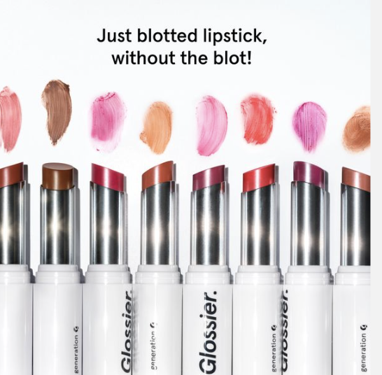
GLOSSIER: 1 cheeky line of copy, a swatch, and the product vessel. If I saw this product in store, I’d recognize it. That’s the point – retail-heavy brands, please take note of this format xo.
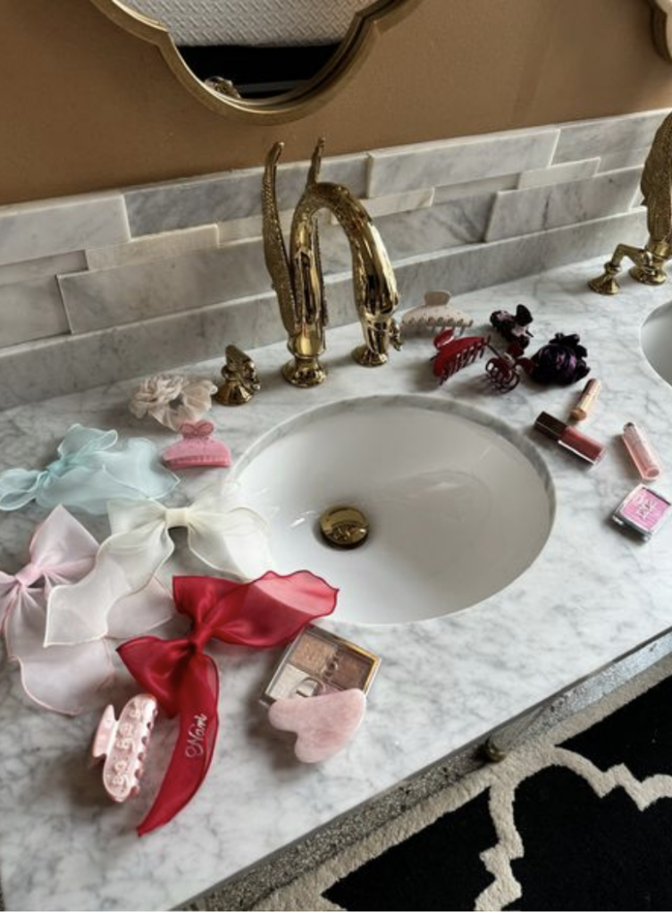
EMIJAY: The shelfie has come and gone, the sinkie is the 2024 version. I’m into it. The collections page that this leads to is GREAT. Shows all of the SKUs shown. And, this brand isn’t scared to mix their products with products they don’t sell – like the Dior Beauty shown. They are punching up! Great to see and worth copying if you have a beauty brand.
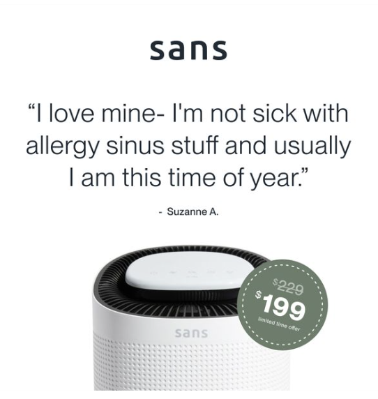
SANS: Great headline, prominent discount, and everything is very proportional. Copy.
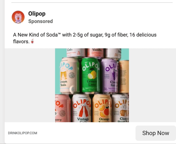
OLIPOP: If you sell a product that comes in multiple flavors, steal this. Stack your product, spin around, and leave the in-platform ad copy to tell the story. All we’re trying to drive is curiosity – the details are available after the click.
I wish this ad didn’t lead to homepage (it does), but copy the style and lead it to a collections page or landing page please!
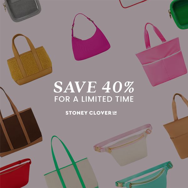
STONEY CLOVER LANE: The gradient REALLY stands out. The offer really shines. STEAL THIS FORMAT IMMEDIATELY! Their ads have really been doing it for me.
Like this ad, too:
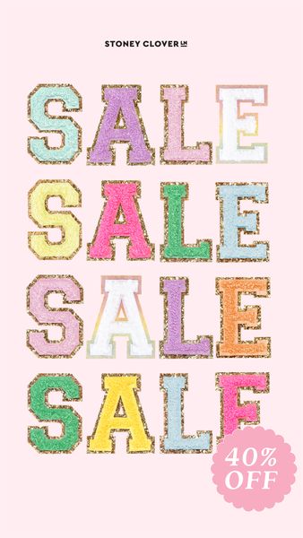
STONEY CLOVER LANE: Same message, totally new format. Clear as day!
HEXCLAD: President’s Day ad creative, that leans heavily into the holiday. Save this – Memorial Day, President’s Day, July 4th, I could go on.

PARACHUTE HOME: This ad is how elevated brands should think of Sale creative. Show your beautiful product. Hit on scarcity. Don’t lead with an actual dollar amount. This ad sold me a laundry hamper (2 actually, 1 for me and 1 for Daniel). It didn’t make me buy that chair – but I’m 2 hampers deep and I’m not sure how. THE HAMPER WASN’T EVEN ON SALE! HUMILIATING!
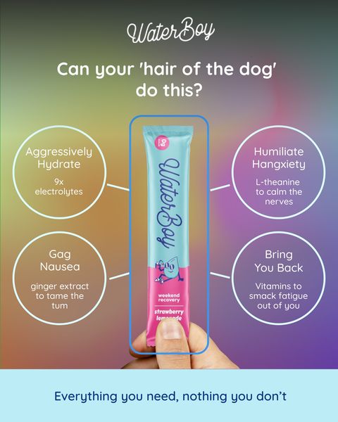
WATERBOY: This ad has been running since November – it’s working for them. Do with that what you will copy the format.
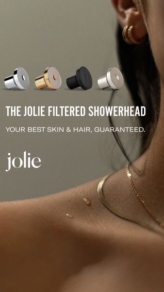
JOLIE: This ad is simple. It’s beautiful. It shows the variants available, which is really helpful to see because if I only saw this in Gold I wouldn’t want it. But the black one matches my bathroom. Silver might match yours, hence why this works. Show off your variants in this way. It’s very well balanced and easy to read but actually a fuck ton going on.

HALFDAYS: 2 best friends having fun in the snow, looking cute, post- aprés clearly. Perfect for a skiwear brand. Let this be a reminder to show people happy and having fun with your product. That’s why we buy things – for our future happy selves.
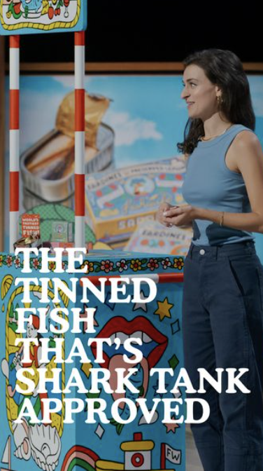
FISHWIFE: The perfect template if your product has been featured on Shark Tank but also on any TV show or that carries any badge.
This could read like this (pretend it’s for a brand that sells Passionfruit and is certified Organic):
THE
DRIED
PASSIONFRUIT
THAT’S
USDA ORGANIC
CERTIFIED
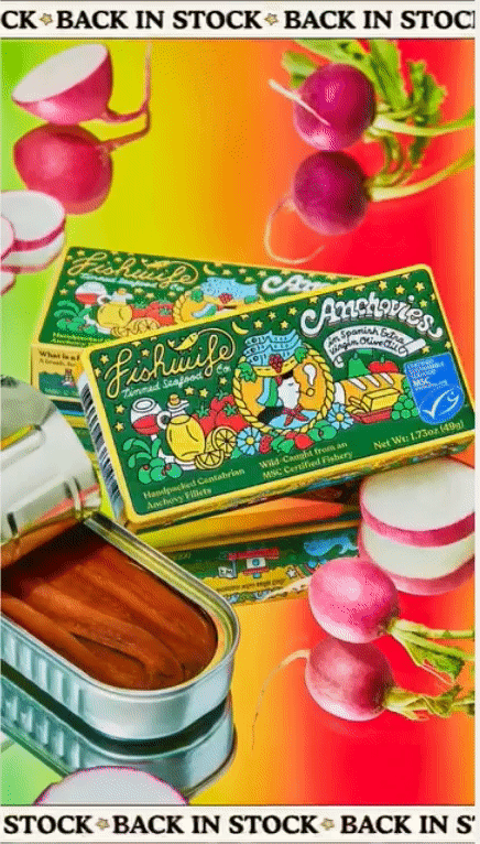
FISHWIFE: I love this ad, too. A gif with a marquee in motion. Works too well.