11 February 2024 | Marketing
25 Websites I Like
By Ari Murray
There’s a particular thing I love about each of the 25 websites listed below. These are website examples that I implore you to study and learn from and copy and then you’ll make millions. This is my wish for you.
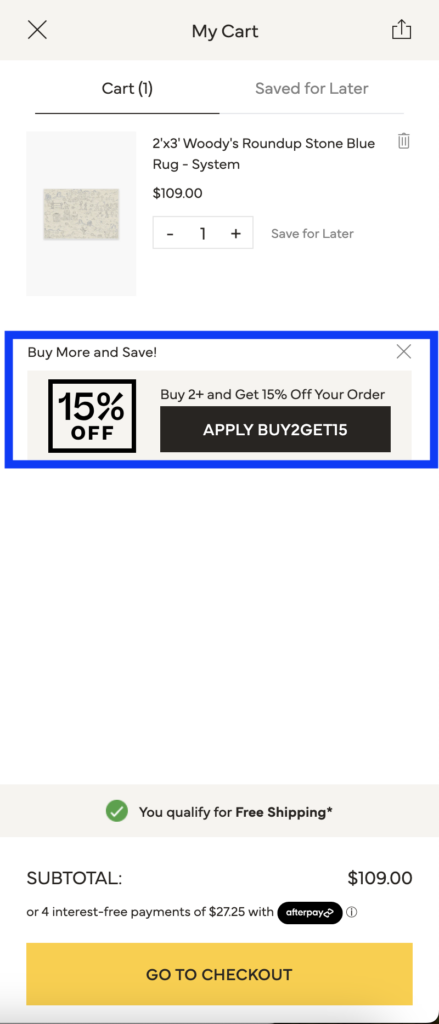
1️⃣. Ruggable’s slide-cart upsell. I usually do this upsell as a script – but the button layout is clear to me and easy easy easy to catch your attention as you shop. I did end up only buying 1 rug (I couldn’t find a 2nd I liked and I REALLY tried but rugs are a lot of pressure). This is the rug I bought.
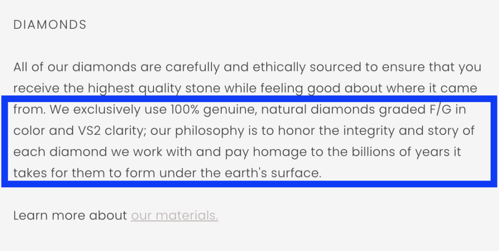
2️⃣. Jade Trau’s below-the-fold PDP description of their diamonds is actually very rare. I am on the market for a birthday present LOL and so I’ve been looking EVERYWHERE at EVERYTHING I have no chill and the sheer LACK OF DETAILS ON MOST DIAMOND PDPs is such a miss. This section sets the stage:
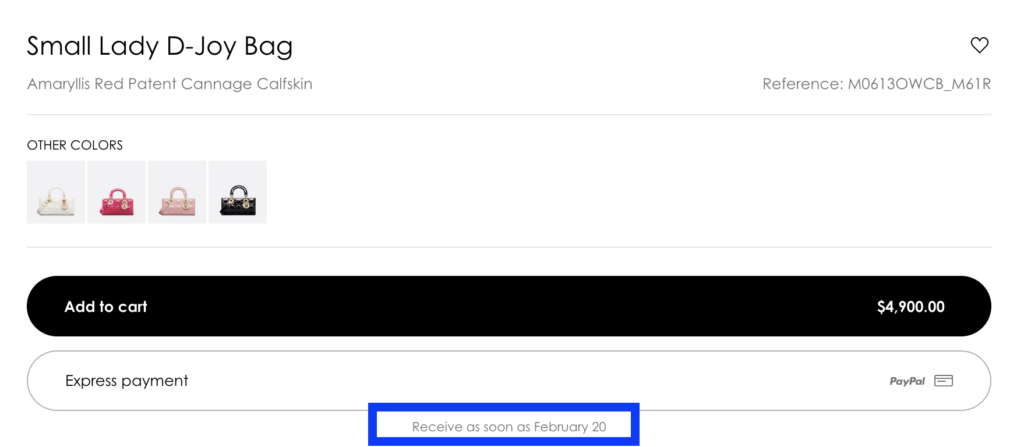
3️⃣. Dior’s bellow-the-button delivery timeline is worth stealing right away. Do you know what’s better than seeing ‘ships in 3-4 days?’ – THE EXACT DAY IT WILL DELIVER. This feels promissory – which instills confidence to pull trig. Also, the ‘receive as soon as’ isn’t actually a promise – it’s a target. So the brand is protected. STEAL THIS!
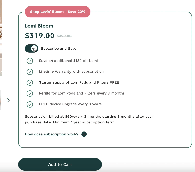
4️⃣. Lomi’s subscription toggle makes it look absolutely shitty to not subscribe. Toggled on – and the perks overflowth. Toggled off… not cute. (Thus forcing you to want to subscribe).
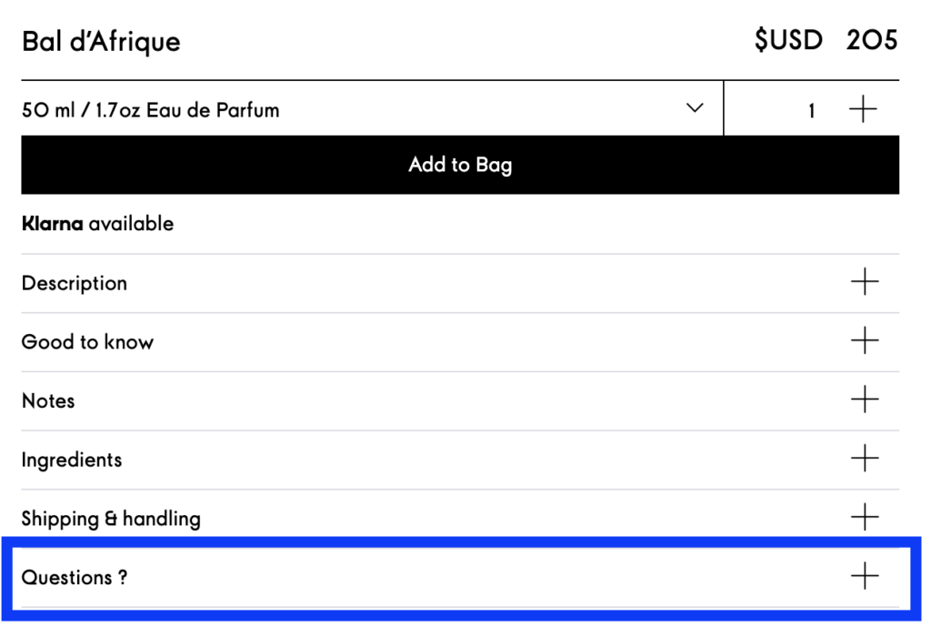
5️⃣. Byredo’s product info accordion is an example of objection deflection. The brand provides all the info they think they possible can, and then at the end, leaves room for questions. When you invite your customers to ask questions, you say WAIT WAIT DON’T LEAVE LET US PERSONALLY HELP YOU. When you expand the accordion, there are 3 perfect optoins – Email, Live Chat, and Call. Unstoppable. Cult Gaia Does this too. (I’ll show you).
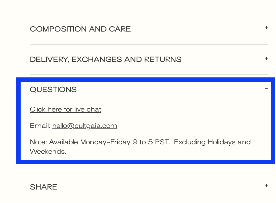
6️⃣. Cult Gaia’s PDP accordion has the same QUESTIONS section as Byredo. Love it. 🌹
7️⃣. Speaking of Cult Gaia, their homepage mixes the fundamentals (Accessibility widget, promobar, search icon) with ready-to-wear coolness. I live for their campaign assets and I look to their website for inspiration often and always.
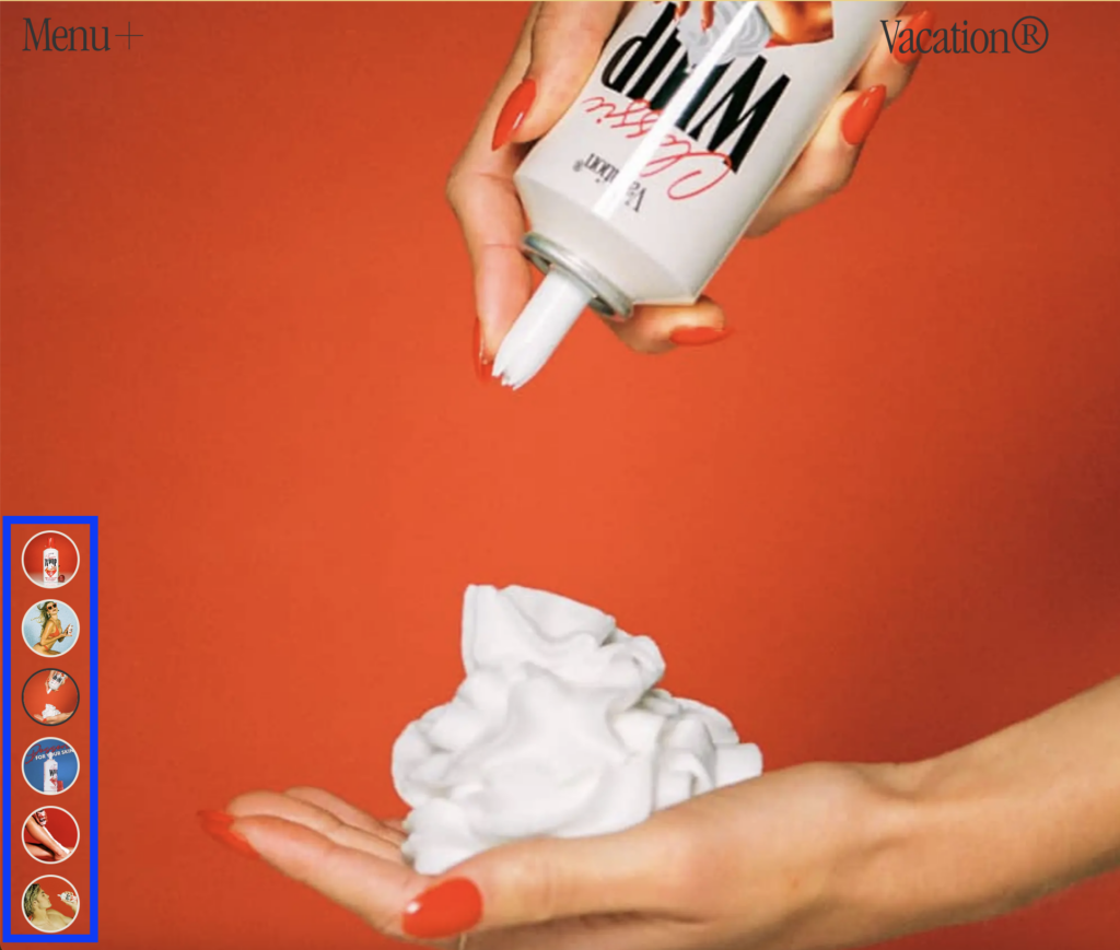
8️⃣. Vacation’s PDP carousel is very interesting. You can see what’s coming, the colors are inviting to click through, and – it’s 1 of 1. I’ve never seen a site that had this exact layout. Feels EXPENSIVE but it’s actually just CREATIVE.
9️⃣. Khaite’s runway show (on desktop) as homepage hero isn’t a new concept. The model STARING AT ME AS SHE WALKS DOWN THE RUNWAY? Chills.
🔟. Huron’s copywriting always makes me smile. The hero homepage eyebrow text: ‘Get a whiff of this’… STUNNING. Linking the Huron Eau de Parfum for you to buy your hubby or boyf for Valentine’s Day. Chip chop.
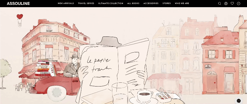
1️⃣ 1️⃣. Assouline’s hero homepage is my favorite hero homepage of any brand on this list of 25. High-effort.
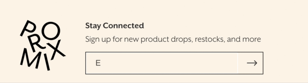
1️⃣ 2️⃣. Promix’s email capture animation is inviting. That’s the whole point! I fucking live for their birthday cake protein bars and make those things my entire personality. 🎂
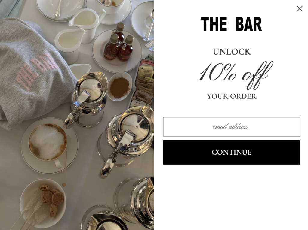
1️⃣ 3️⃣. The Bar’s lo-fi, seasonally appropriate email capture that matches the hero homepage creative that sits behind it is exactly what to copy. Do not hesitate to update your site – hesitate to keep it the same. Updating the creative in your CRM capture also costs $0 to update – just needs your effort! If that sounds preachy that’s because it is LOL.
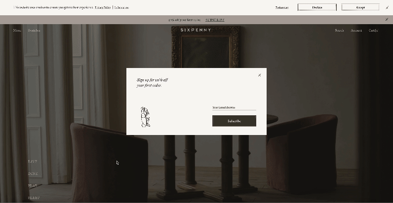
1️⃣ 4️⃣. Sixpenny’s cookie compliance banner placement and treatment. Top of the screen – which is a bold choice. I really love it and am going to test this out myself. It fits in really nicely on their site – doesn’t disrupt and importantly – doesn’t block the creative that features a STUNNING video that shows off their hugely expensive and beautiful furniture.
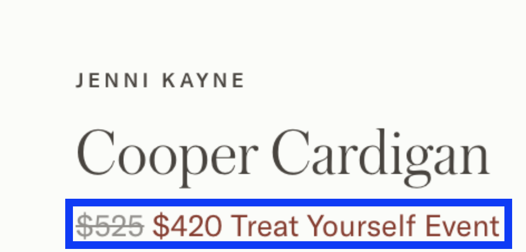
1️⃣ 5️⃣. Jenni Kayne’s sale strikethrough includes the NAME of the promo. This is important – anchors the deal to a fleeting, once a season moment. Urgency. No brands do this????? Let’s change that and copy xo.
1️⃣ 6️⃣. Djerf Avenue’s 404 page is low-dev and HIGHLY creative. I live for a 404 page that tries. It’s frustrating to trigger a 404 as a customer – unless that 404 is branded and then it’s a positive experience. UPDATE YOURS PLEASE.
1️⃣ 7️⃣. Via Carota Craft Cocktail’s 404 is another great example – update yours PLEASE.
1️⃣ 8️⃣. Calirosa’s 404 page is yet another great example. UPDATE YOURS PLEASE.
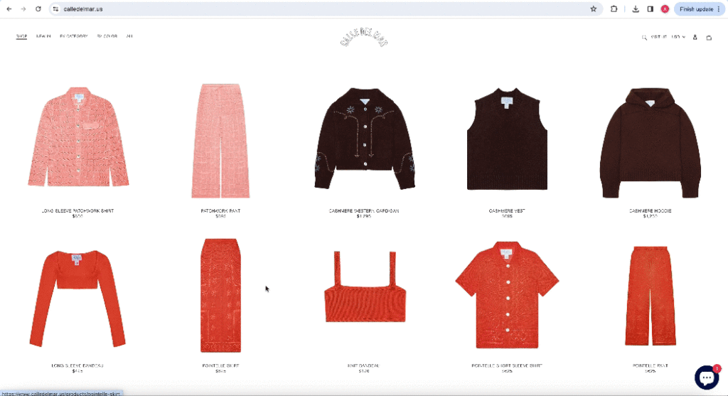
1️⃣ 9️⃣. Calle Del Mar’s collection-style homepage has been re-merchandised for winter. I will never get over this site – if I had a clothing brand, this is the homepage approach I’d take. I don’t – but I do want to start my own DTC diamond brand one day. The more you know LOL.
2️⃣ 0️⃣. Olipop’s grape soda PDP is purple. Like a grape. Get it? Right, of course you do. That’s what I’m saying – obvious is exactly what we’re going for in site design. Clear > clever. Best flavor ever. Hannah won the 12-pack I gave away a few weeks ago!! I hope she loves grape as much as I do.
2️⃣ 1️⃣. Jennifer Fisher’s split-screen hero homepage does it for me. I love a split-screen. A great use of above-the-fold real estate.
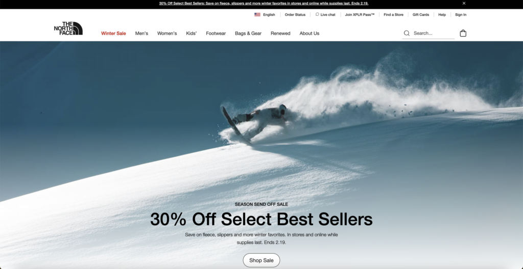
2️⃣ 2️⃣. The North Face’s hero homepage does winter really well. If you sell anything wintery- make sure you’re showing snow early and often on your site a la The North Face.
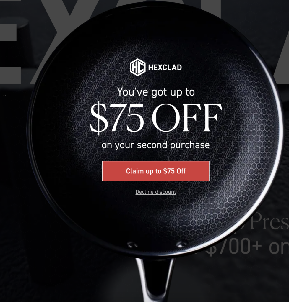
2️⃣ 3️⃣. HexClad’s new cookware shaped CRM capture is everything.
2️⃣ 4️⃣. Summer Friday’s split-screen hero homepage – does a lot with little real estate. Works every time.
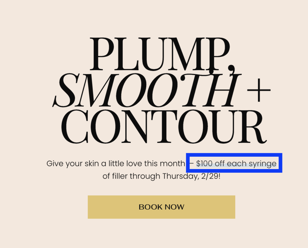
2️⃣ 5️⃣. Skin Pharm’s blue highlight stroke for emphasis really does it for me. When building your brand guidelines, leave room for accent colors. I beg of you! Skin Pharm’s Crystal Clear Clarifying Pads are core to my husband’s skincare routine BTW. 🩵