17 June 2023 | Marketing
🍀 27 Website Examples
By esper
1️⃣. Toteme’s NAVIGATION

2️⃣. Pangaia’s HERO HOMEPAGE MODULE promoting their Naturalists Club Collection. (I LOL at the way they use nature here). This also carries through once you click the CTA and land on the collection – it’s incredibly consistent.
3️⃣. Eight Sleep’s WALL OF LOVE. (Every brand needs something similar – this is how you gather and curate SOCIAL PROOF). P.S. Best bed in the entire world.
4️⃣. Dae Hair’s NEW PRODUCT LAUNCH PDP. The campaign shoot assets play ever so nicely with the DETAILS of the product. Fun meets ‘this is well formulated and I’ll tell you how’.
5️⃣. Emi Jay’s LOOKBOOKS. This template couldn’t be more simple. But it’s really special – because of the lo-fi (low-fidelity), REAL photos that go on for rows and rows. Spending $ on real life events and capturing them > expensive photoshoots and expensive, overly tricky website development.
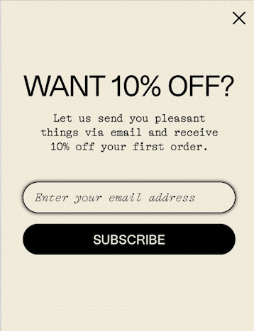
6️⃣. Fishwife’s EMAIL CAPTURE POPUP. So on brand it hurts. 🐚
7️⃣. Kartell’s BADGE OVERLAY. (I don’t like anything else about this PDP but I do want that lamp). So, maybe the page design isn’t so bad? LAMP OF MY DREAMS.
8️⃣. Khaite’s SPLIT-SCREEN PDP. Darkmode for product info, and all eyes on the product itself. I really love this and want to split-test something exactly like this. My bet is that carefully placed darkmode increases conversion (will let you know what I find).
9️⃣. Dior’s PERSONALIZATION POPUP is worth copying.
🔟. Rimowa’s PERSONALIZATION STEP-BY-STEP JOURNEY one-up’s Dior’s experience. If I need my customer to personalize one thing (a 1 step journey), I’d do the Dior play. But for anything multi-step, Rimowa Unique is my forever north star.
1️⃣1️⃣. Djerf Avenue’s RESTOCK CTA is too subtle for most brands to copy. But, Djerf Avenue isn’t most brands. Their fruit collection sells out every single time they talk about it. So, they have the luxury to whisper about the restock. Copy this HOMEPAGE HERO for a 3-card hero inspo. Unless your brand is powered by Matilda Djerf, emphasize your CTA more dramatically.
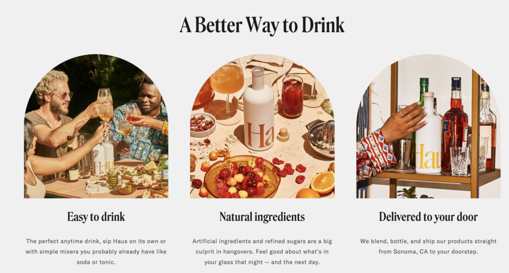
1️⃣2️⃣. Haus’ below-the-fold VALUE PROP MODULE is perfect to me. It’s clear, it’s nice to look at, and it’s exactly the summary I am searching for.
1️⃣3️⃣. Wonder Valley’s FAQ PAGE. A page that never gets enough attention (considering how the visitors to the FAQ page are on the very edge of buying – delight them while you teach them).
1️⃣4️⃣. ARMRA’s SPLIT-SCREEN PDP. (THE THEME OF THIS NEWSLETTER IS SPLIT-SCREEN).
1️⃣5️⃣. DSTLRY’s SPLASH PAGE. 🦸♂️🦹♀️
1️⃣6️⃣. ^ is much better than the alternative (Out of the box splash page example here). HERE is another fab SPLASH PAGE example (this is a good coming soon north star to copy – just mark everything as sold out but get the word out EARLY).
1️⃣7️⃣. SET ACTIVE’s current HOMEPAGE HERO (Shows 4 looks, looks high tech, is 1 static asset to upload with 0 dev work needed).
1️⃣8️⃣. Haven Athletic’s PRODUCT PHOTOGRAPHY CAROUSEL. Scroll through the 15!!!!!!! assets in the carousel and tell me you don’t want this backpack (I want this backpack 🛒). SHOW NOT TELL.
1️⃣9️⃣. Danielle Frankel Studio’s ENTIRE HOMEPAGE. Not a word of text in any of the homepage modules. Not a CTA present. But yet, I understand.
2️⃣0️⃣. Casamigos‘ LOADING STATE. Did you catch that? The video load then age-gate capture background switch? IT’S ALMOST LIKE THEY ANTICIPATED THE EXPERIENCE OF THE VISITOR AND PLANNED FOR IT! (They did! 😍). Make legal requirements part of the plan (age-gate upon page load for new visitor), and not an afterthought.
2️⃣1️⃣. Pentagram’s ABOUT PAGE COPY. A fun fact about me is that this line from this page is my single favorite line of copy that I’ve ever read on a website: “Our 22 partners are all practicing designers, and whether working collaboratively or independently, they do so in friendship.”
2️⃣2️⃣. Trudon has MY SECOND FAVORITE LINE OF COPY that I’ve ever read on a website (describing the brand’s history as beeswax candlemaker to the king) : “Its moto becomes “DEO REGIQUE LABORANT”, which means: “They work for God and the King.”, “they” being the bees.”
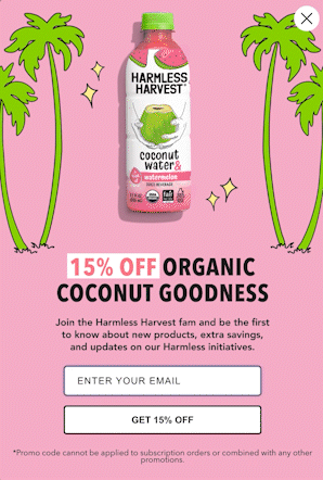
2️⃣3️⃣. Harmless Harvest’s EMAIL CAPTURE POPUP. Movement! TEST THIS FOR YOURSELF!!
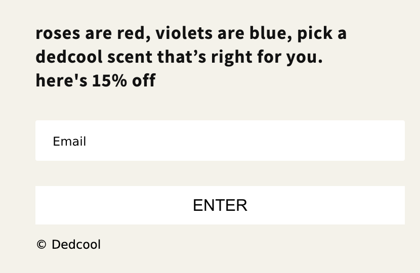
2️⃣4️⃣. Dedcool’s FOOTER EMAIL CAPTURE. It’s the little things.
2️⃣5️⃣. Aimé Leon Dore has my SECOND FAVORITE STREETWEAR WEBSITE. (Yes, I wait in line to shop at their store when I come to NYC – yes, it’s a humiliating experience).
2️⃣6️⃣. Minted New York’s WEBSITE is my SINGLE FAVORITE STREETWEAR SITE. It’s as cool as Aimé Leon Dore’s. But, doesn’t try as hard.
2️⃣7️⃣. BAGGU’S EMAIL CAPTURE POPUP (only this part). MOTION!!!!!!