You know how important your email popup is and yet you likely aren't spending enough time making it better. Good news is the bar is on the fucking floor. 🧛♀️ 🧛♀️ 🧛♀️ 🧛♀️ 🧛♀️ 🧛♀️ 🧛♀️ 🧛♀️
Almost every brand you love has a popup that isn't optimized, isn't tested, and is forgotten.
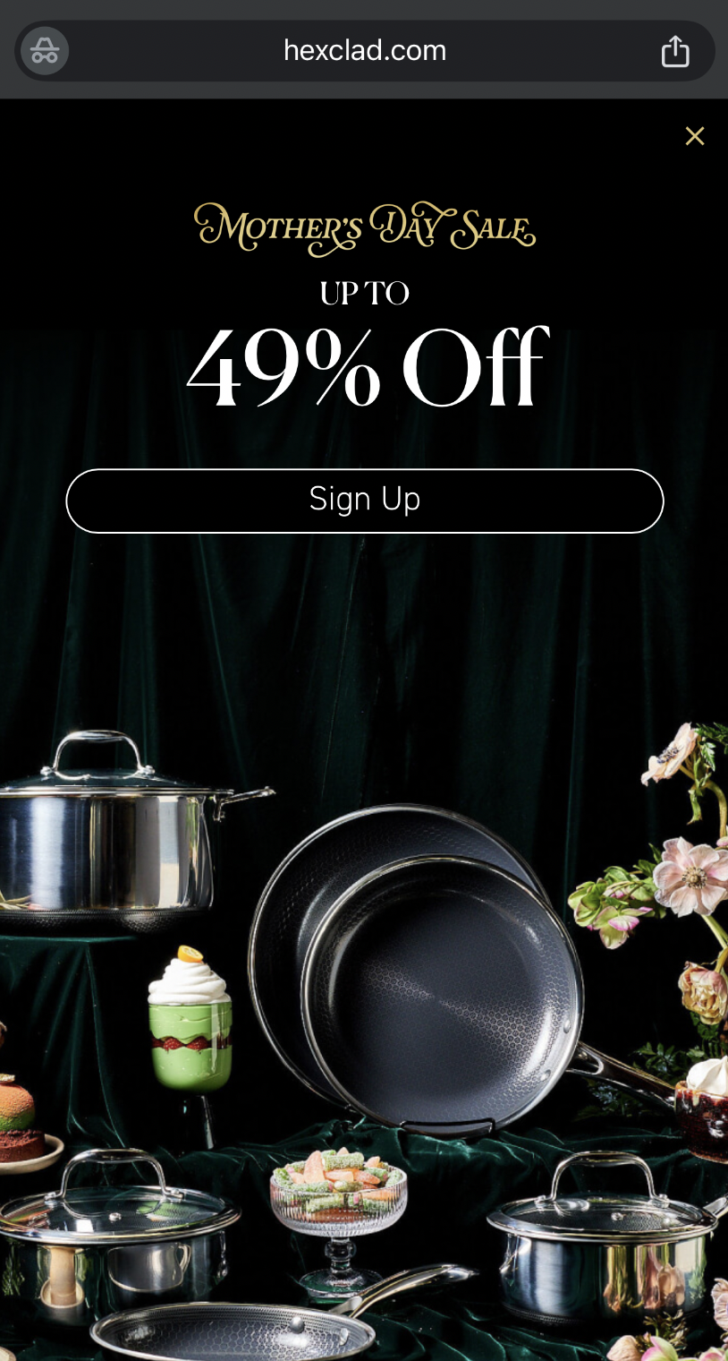
Almost every brand you love doesn't update their popup when they run a sale.
Almost every brand you love doesn't switch their assets depending on the time of the year or what they've just launched.
Almost every brand you love plays it too safe.
As such, sharing 6 examples that are better than most. Importantly, I'm showing them ranked - from least strong to strongest. Strongest is the last example shown.
I'll explain why. But, only if you promise to action a test against your popup this week. Hint - I want you to launch a quiz funnel. Not to be like this but it's only Wednesday. I'm sorry!
🧛♀️ 🧛♀️ 🧛♀️ 🧛♀️ 🧛♀️ 🧛♀️ 🧛♀️ 🧛♀️
The 6th best - Retrofete.
What I like 🍀: Good because the creative is seasonal + the copy is specific to what they sell.
What I'd change 🥀: Wish it were a full screen takeover on desktop. Wish the word newsletter wasn't used. Wish the offer of 10% was more prominent outside of the CTA.