20 July 2022 | Marketing
Content design > content writing
By Tracey Wallace
Blog post UX components to improve ranking and convert
A couple newsletters ago, I revealed that one of my mantras for content teams is:
Finally, how we present is just as important as what we present. Our content has two seconds to convince someone to continue reading, watching, or listening. The way we present our findings communicates to our audience our level of investment and seriousness about our goal. Our content must inspire and educate without overwhelming—in both the design and the copy.
This is important, and custom blog design is one of the best, earliest opportunities to reinforce brand aesthetics and authority, as content is commonly one of the first ways folks are exposed to the brand.
In addition, here is what we know about readers:
- 6 in 10 people share content without clicking on it or reading it (only read headline + see meta-image that pulls through)
- 79% of readers scan content rather than read word-by-word
- 38% of ppl stop reading content simply because they don’t like the layout and…
- 75% of them make a judgment on the company’s credibility based on site design
This means that content design matters even more than content quality. Full stop. Creating a high-quality, thought leading content program requires collaboration with design so that every piece has the most impact.
There are two main ways to do this.
First begins with your blog’s UX. The second is about the more specific day-in and day–out content and design team collaboration. We’ll cover that next week.
For this week, I want to focus specifically on blog UX features and components.
I’ve made this notion (plus a downloadable deck) here to walk y’all through all the things that I’d have on my ideal blog. It’s my hope you can use this with your own design and development team to create high-quality, highly-scalable blog experiences on your site, too.
Here’s a quick preview:
The components I cover in the deck––along with examples!––include:
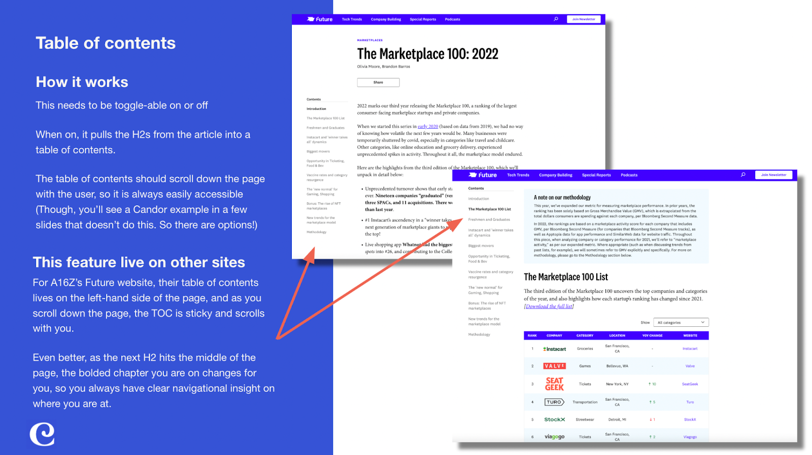
- Table of contents
- Blog post download
- Intro summary / sub head
- Author / Editor / Designer
- Read time / eyebrows / date
- Pull quotes
- Easy to identify header styles
- Related resources CTA
- Drop cap styles
- Call-out boxes
- Newsletter CTA
- Start trial / demo CTA
- Designed bullets (numbered and un)
- Photo placement options + caption alignment
- Hero section options
- Embed capabilities for video, audio, social posts, etc.
- Table styles
It’s really important for all of these that your development team makes these elements toggle-able. That means that on the backend of your CMS, you should be able to toggle a component on or off for each individual blog post.
This is how you scale content design on the blog itself, and make the blog work harder for you. When you can toggle components on or off, you can control how the blog looks, its UX experience (not all blogs need a table of contents, for example), and so much more.
Dive on in here, and let me know your thoughts––including the blogs you think have the best UX right now. I’d love to check them out!
That’s it for this week! Next week, I’ll walk you through how to plan out your individual blog design needs including hero images and more. Better yet, we’ll look at how to do this without burning out your design team, and how to set them up for success, too.
See y’all then!
A note of this advice:
You do you!
One content marketer’s best practices aren’t always right for another one, though I do try to distill out the main concepts and core practices I believe everyone can benefit from. That said, you must use good judgment when deciding whether to take advice given from folks on the internet. I am an expert, and this advice comes from my direct experience, but I am not smarter than you, and I have nothing to gain or lose because of what you do.