21 July 2022 | FinTech
Fintech Logo Rankings
By Alex Johnson
Most of my career has been spent in marketing. And in my time working as a marketer, I came up with a very simple rule, intended to help me avoid professional heartbreak — never ever work on a project that involves names or colors.
Why?
Because everyone has a favorite color and everyone has had at least some experience naming things … and so everyone has an opinion, an opinion that they feel is just as valid as yours (or the branding agency you hired to help you).
It is, put simply, a nightmare.
I share this because I want any fintech marketers who are reading this essay to know that I understand; I feel your pain, and I want you to know that it’s not my intention to add to your suffering. I understand if you choose to stop reading this essay right here. Go in peace.
Now, with that out of the way, let’s get down to business.
Here are the rules:
- This is entirely subjective. I tried to follow a loose set of guidelines for how I developed my rankings (see below), but, ultimately, this list is a reflection of my personal tastes developed over 15+ years working in marketing and countless hours spent copying and pasting fintech logos into PowerPoint decks.
- Logo rankings have nothing to do with the companies or their products. Paul Rand, the father of the modern corporate logo, designed Enron’s logo (and it was a glorious piece of art).
- Speaking of Paul Rand, my general taste in logos aligns well with his edict that logos be “distinctive, memorable and clear.” Such logos do well in these rankings.
- History and market position matter. A lot of the value of logos comes from their association with the company and its products. If the company has been around for a long time (in fintech-adjusted terms) or has been unusually successful or impactful, its logo will do well in these rankings. That said, historical value and market position can only do so much (sorry PayPal).
- Extra points are awarded to any logo that is obviously visually aligned with the company’s name and/or product.
- The primary logo is what I’m judging here, but a company’s extra artistic flourishes (color pallet, iconography, hidden symbols, etc.) can tip the balance. I also like it when a company goes out of its way to explain its brand and what inspired it (especially after a rebrand).
- The list of logos that I judged was sourced from a variety of places (CB Insights, TechCrunch, VC firms’ portfolios, my own brain). I do not claim that it is comprehensive, but I want you to know I looked at a lot of logos.
- The list is presented in tiers. You can think of any logos presented in the same tier as being relatively equal in these rankings.
- All ties were broken by my wife, who has excellent taste and a healthy disinterest in fintech.
Honorable Mentions
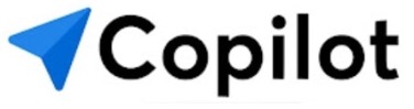
#30: Copilot — The blue arrow conjures images of maps and GPS systems and navigation, which is a nice metaphor for personal financial management.
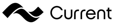
#29: Current — It occurred to me, when making this list, that coming up with a simple visual depiction of a current (either electrical or oceanic) wouldn’t actually be very easy, so kudos for dreaming up something that gets the point across. Also, Current outlasted Libra/Diem/Calibra/Novi, so that’s a win.
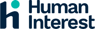
#28: Human Interest — Combining the ‘h’ and the ‘i’ with only the teal dot is a clever bit of artistry. As is stacking the name, so that the overall size of the logo doesn’t feel out of proportion.
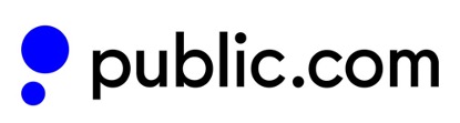
#27: Public — The circles that look like speech bubbles is a nice callback to Public’s main point of differentiation — a community, in which investors can talk to and learn from each other. They also chose a shade of blue that is relatively unused in the world of fintech logos.
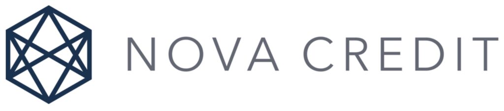
#26: Nova Credit — Nova Credit built the infrastructure to allow credit data from one country to be used by lenders in a different country. The interconnected hexagon conveys that idea simply and the dark blue and light gray colors fit nicely together.
OK, now on to the main event — the top 25 fintech logos!
Points for Creativity
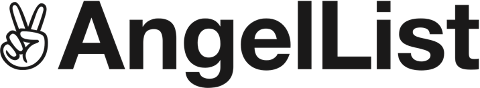
#25: AngelList — I’m not sure what the V sign (which has a much longer and more complex history than I was aware of) has to do with what AngelList does, but I do know that it makes for a cool and very distinctive logo.
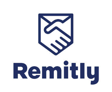
#24: Remitly — An international money transfer service that uses a handshake as the foundation for its logo? Yes, please! My only knock is that, purely as a visual representation of a handshake, it looks a bit square and unnatural. Did we need to squeeze it into a pentagon?
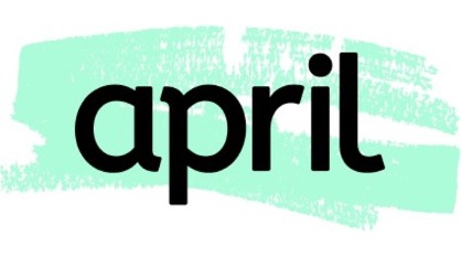
#23: April — Again, I’m not 100% sure what the logo has to do with the company or its product, but I am sure that it is unique among all the fintech logos I’ve seen. The mint green brush of paint behind the company name definitely catches the eye.
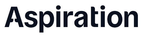
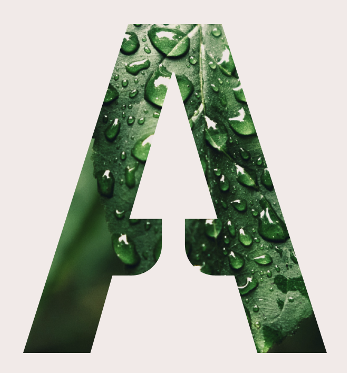
#22: Aspiration — This wouldn’t have made my top 25, except for two inspired little touches. First, the negative space inside the first ‘A’ looks like a pine tree, which, given Aspiration’s products and company mission, is [chef’s kiss]. And second, Aspiration has some cool secondary corporate art (see below), which nudges it up these rankings.
Saying A Lot
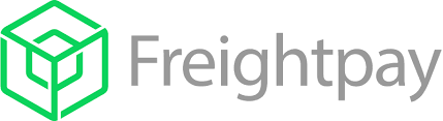
#21: Freightpay — The shape used in this logo is called a tesseract. It looks cool and carries obvious connotations to the company and its products (digital payments for the shipping and logistics industry). My only (slight) knock is that it, combined with the company’s lengthy name, is a bit visually overwhelming.
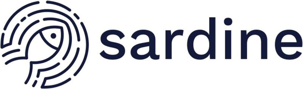
#20: Sardine — The fish swimming through the water and creating ripples that look a bit like a fingerprint is a clever way to tie the company’s name and products together. I just wish the logo was a bit easier to make sense of when it’s shrunken down to a smaller size.
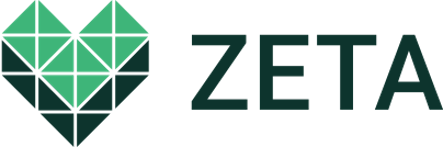
#19: Zeta — Zeta is a banking app for couples, so the heart shape is an effective way to emphasize the core mission of the company. And I like the suggestion that the light green (the couples) are building on top of the dark green (Zeta). However, the number of boxes and crisscrossing white lines do start to strain your eyes if you stare at it for too long (which I have been).
Clear and On Point
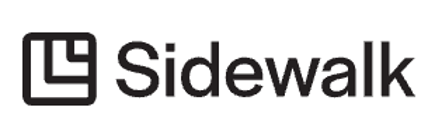
#18: Sidewalk — Our only insurtech on the list! The self-contained boxes elegantly convey the notion of neighborhoods (Sidewalk insures neighborhood businesses) and I really like how the width of the lines in the image match the width of the lines in the text.
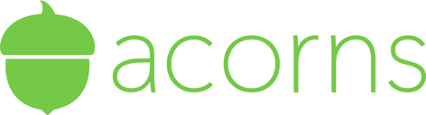
#17: Acorns — Nice and easy does the trick in this case. A company called ‘Acorns’ should have an acorn as a logo. I also like how the acorn is bigger than the text, perhaps indicating the growth potential of your initial investment?
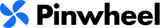
#16: Pinwheel — The offset position of the pinwheel gives the illusion of movement and inspires images (in the minds of VCs, at least) of a flywheel picking up speed.
#15: MoneyLion — MoneyLion got its money’s worth with this rebrand. The blended green blue is distinct, without feeling like it’s relying on the played-out color gradient trend. The shape looks organic (like a lion’s mane), and the image of the lion’s face strikes the right balance between obvious and subtle.

#14: Petal — It’s a bold choice to use your entire color palette in your logo, but it works in this case. The circles representing the petals on a flower are subtle but easily understood. And the vertical lines in the font look like stems that could support a flower.

Simple and Distinct (with unique colors)
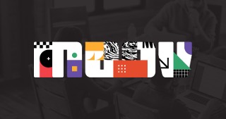
#13: Moov — The large, block-like font is the showstopper here, obviously. However, I really like how Moov plays around with a truly wild assortment of colors and patterns in the secondary logo marks that it creates (see below).

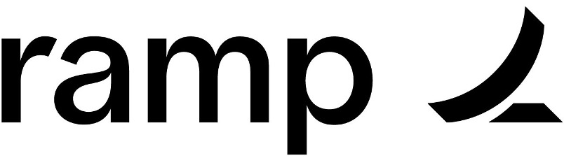
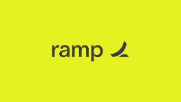
#12: Ramp — There’s something deeply appealing to me about a logo in which the company’s name is all in lowercase letters. It feels unpretentious and approachable. Ramp also opted for a ramp shape that’s less inclined plane and more skatepark, the insinuation being that its customers are about to be launched into the stratosphere. And the yellow color used in secondary logos (see below) isn’t my cup of tea, but it’s certainly distinctive.
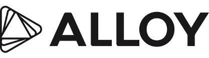
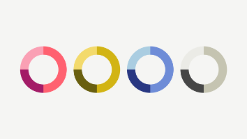
#11: Alloy — They took the ‘A’ in Alloy and rotated it multiple times in order to create the logo, which is meant to convey the value of looking at a problem (like financial crime) from multiple angles. Nice symbolism. Also, the color palette (see below) is striking (you don’t see pink used often enough!) and used to good effect in the company’s marketing. Also, bonus points for explaining your rebrand!
Charmingly Abstract
#10: Braid — A multiplayer fintech app that depicts the value of combining finances together through a simple, abstract image (two obviously different shapes overlapping) that also ties nicely into the name. You could easily sketch this (and variations of it) by hand in a notebook, which is a good test (IMO) of an effective logo.
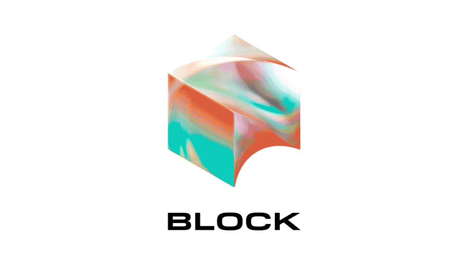
#9: Block — Or you could go the other way and build a logo that no one could possibly sketch in their notebooks — a moving logo! I’m not sure how much the company paid for this rebrand, but it produced far and away the most unique visual asset in fintech (and maybe in any industry). I also enjoy how Block’s media kit insists that you use the animated version of the logo rather than the static one. That’s commitment!
Good Taste and a Whole Bunch of Money
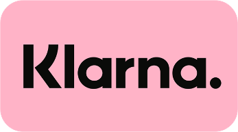
#8: Klarna — The combination of the font (slanted and angular) and the colors (pink and black, which most brands wouldn’t dream of combining) makes for an incredibly memorable look. And Klarna goes to great lengths to ensure that its look gets in front of as many eyeballs as possible.
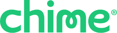
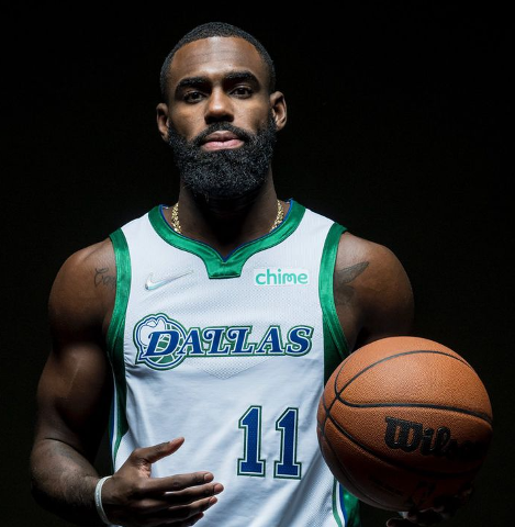
#7: Chime — I was prepared to kill Chime’s logo in these rankings, not because I don’t like it (the cheerful green and curvy font are actually quite nice), but because I absolutely hate it when companies force their logos onto professional sports teams’ jerseys and stadiums. That is sacred territory and most companies’ logos clash terribly with teams’ existing logos and colors. But Chime and the Dallas Mavericks actually make for a cute couple (see below). Hats off.
Standout Rookies
#6: Hummingbird — I mean, this is just delightful! The hummingbird looks like it’s exerting no energy while staying confidently aloft, which (I imagine) is exactly how the company wants compliance professionals to feel while using its product.

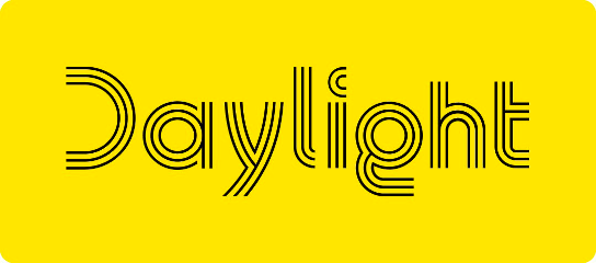
#5: Daylight — The bright yellow refuses to hide in the crowd of fintech greens and purples (seriously, what is with all the green and purple in this industry?) and the multiple-line font evokes the image of rays of sunlight just peeking over the horizon. And the “D” with no vertical line is also a marvelous touch. A+
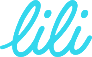
#4: Lili — This logo makes me want to step away from my computer, pick up a pencil, and practice my cursive writing. Just gorgeous. The light blue is an underused shade in corporate logos (and has the nice side effect of pairing wonderfully with a white background) and the symmetry of the all-lowercase letters feels somehow both informal and polished.
Established and Aligned
#3: Plaid — An argument could be made for Plaid to be in the top spot, especially given the company’s influence and visibility in fintech. The logo itself is simple and yet it conveys a great deal — connecting back to both the fabric pattern (which, itself, has become a bit of a theme for fintech brands) and the purpose of the company — connecting banks and fintech companies and consumers together.

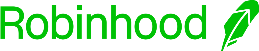
#2: Robinhood — The feather, inspired by the feather in Robin Hood’s bycoket hat and conveying the same ‘steal-from-the-rich-and-give-to-the-poor’ ethos that motivated the legendary character, is genius. It’s almost enough to make you believe that trading options and obscure cryptocurrency tokens all day is actually a good idea.
Iconic
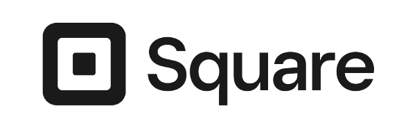
#1: Square — We were never going to land anywhere else. The logo fits the company and the product perfectly. Literally. The original product is the logo brought to life. I showed my wife the logo (minus the name) and she instantly recognized it. The influence of the company and its product (and thus the importance of its logo) is without equal in the modern fintech era.
Jack Dorsey can pivot to bitcoin as much as he likes. If he ever tries to retire this logo, we riot.